


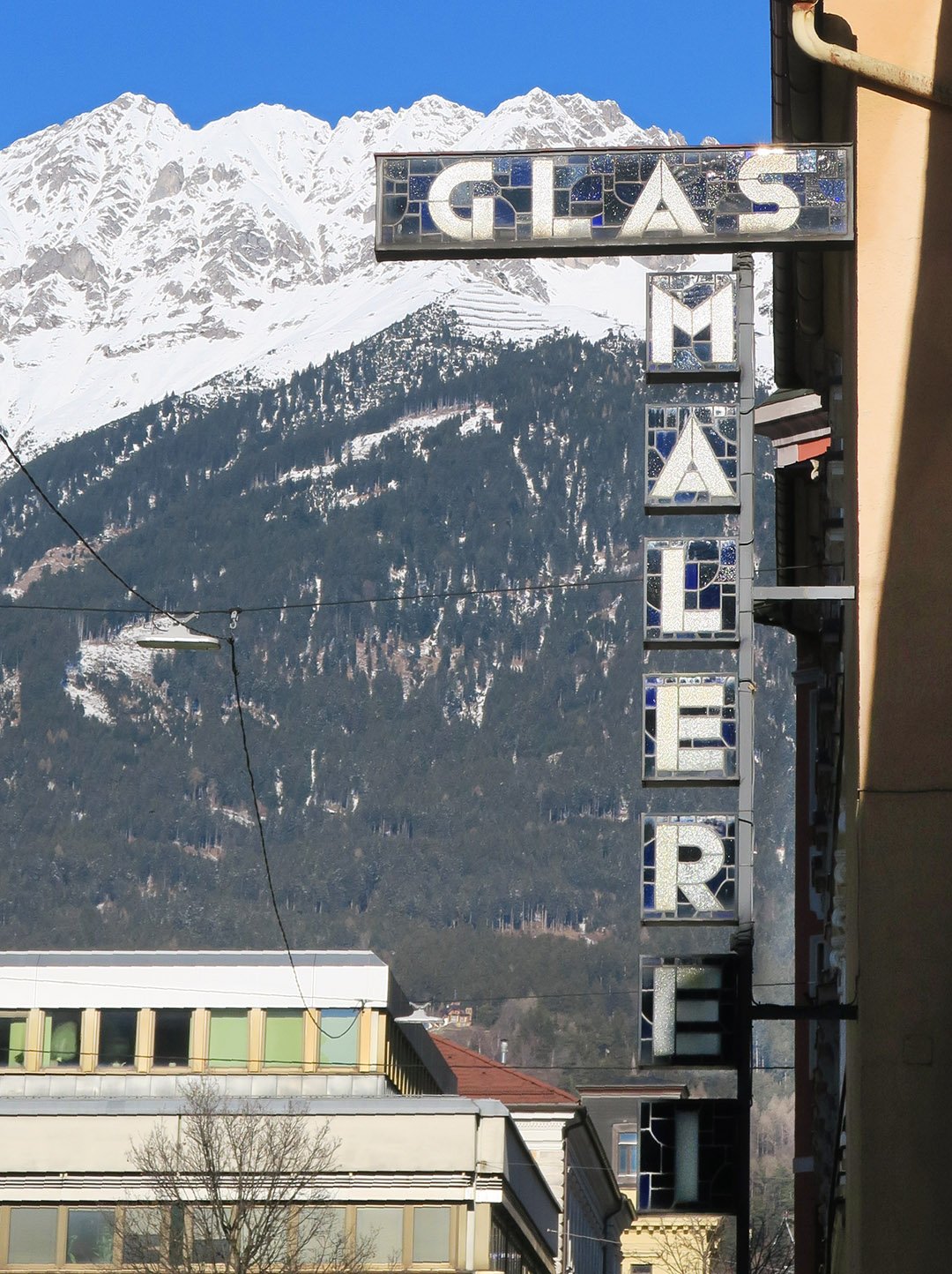
Show me the location on the map
Similar articles
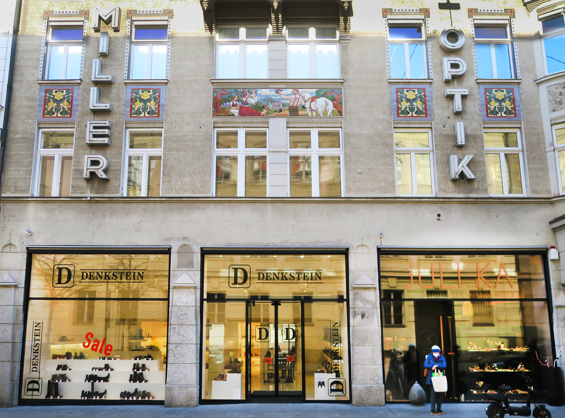
Spring brings a craving for things to do and be out and about--why not take a tour…
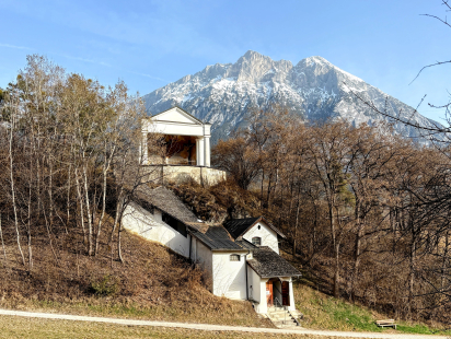
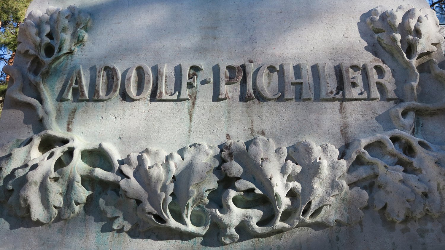
The name of this landscape alone exudes a mysterious magic: St. Moritzen. Located to the west…
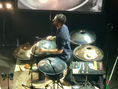
the handpan The Handpan - a more generic term for a Swiss invention first known…
What could you do if the stomach pains became unbearable or a child had swallowed something…